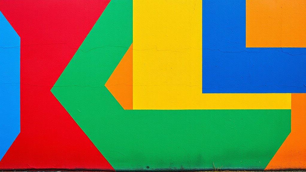

Color blocking involves creating distinct zones with contrasting colors and geometric patterns to make your outfits stand out. You can pair bold tops with subdued bottoms or vice versa, using shapes like stripes or triangles to define each area. Accessories in contrasting hues or patterns also help emphasize different zones. With practice, you’ll learn how to balance colors and patterns seamlessly, making your style more vibrant. Keep exploring to discover more tips for mastering this bold fashion approach.
Key Takeaways
- Use bold, contrasting colors like reds, blues, yellows, and pinks to define distinct zones in your outfit.
- Incorporate geometric patterns such as stripes or triangles to emphasize the separation between color blocks.
- Balance bright tops with subdued bottoms or vice versa to highlight specific zones effectively.
- Start with simple color combinations and gradually add patterns to build confidence and visual interest.
- Strategically pair accessories with contrasting hues or geometric designs to reinforce zone divisions.
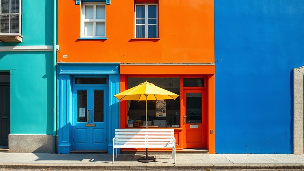
Have you ever wondered how to make your outfits stand out effortlessly? One of the most eye-catching techniques you can try is color blocking, which involves creating distinct zones with contrasting colors. By mastering this style, you can turn simple pieces into bold statements. To start, focus on bold color schemes that grab attention and add vibrancy to your look. Think bright reds, electric blues, vivid yellows, or striking pinks—colors that pop and command notice. The key is to pair these hues thoughtfully, ensuring they complement each other while still maintaining high contrast. This approach doesn’t mean every piece has to be a different color; instead, you strategically combine two or three bold shades for maximum impact.
Color blocking uses bold, contrasting colors to create eye-catching, impactful outfits.
Incorporating geometric patterns into your color blocking outfits adds an extra layer of visual interest. Geometric designs—like stripes, triangles, squares, or hexagons—can be integrated into your clothing or accessories to emphasize the zones you’re creating. For example, wearing a geometric patterned top with solid-colored pants or a skirt can help define each section clearly, making the overall look more dynamic. When mixing geometric patterns with solid colors, pay attention to scale; larger patterns create a bold statement, while smaller ones add subtle complexity. The contrast between sharp, clean shapes and vibrant colors enhances the sense of separation and structure, making each zone stand out more prominently.
To successfully pull off color blocking, think about balance. If you’re opting for a bright top, consider pairing it with a more subdued bottom to let the upper zone be the focal point. Conversely, if you want to highlight your lower half, choose bold pants or skirts in contrasting hues. Accessories like bags, shoes, or jewelry can also help reinforce the zones, especially when they feature geometric patterns or contrasting colors. Keep your overall look cohesive by sticking to a limited palette of bold shades—this prevents the outfit from becoming overwhelming and ensures each zone remains distinct yet harmonious.
Practicing color blocking with bold color schemes and geometric patterns is all about experimenting and refining your eye for contrast. Start with simple combinations, then gradually incorporate more complex patterns and hues as you gain confidence. With a little planning, you’ll find that creating zones with contrasting colors becomes second nature, allowing you to craft outfits that are not only stylish but also showcase your personality. Whether for casual outings or more polished events, this technique transforms your wardrobe into a vibrant playground of color and shape, making sure you turn heads wherever you go. Additionally, understanding the importance of visual contrast can help you select the most effective combinations to make each zone stand out even more.
Frequently Asked Questions
How Do I Choose the Best Contrasting Colors for My Space?
To choose the best contrasting colors, start with the color wheel to identify complementary hues that create vibrant contrast. Consider color harmony principles to guarantee your choices feel balanced and appealing. Pick bold, contrasting shades that stand out against each other, but also match your overall vibe. Test samples in your space to see how they work together, and trust your eye to find the perfect striking yet harmonious combination.
Can Color Blocking Work in Small Rooms or Spaces?
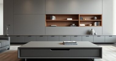
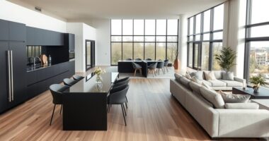
Color blocking works well in small rooms, helping you define zones and add visual interest. Use contrasting colors strategically around your furniture placement to create a sense of separation without overwhelming the space. Incorporate decorative accents in bold hues to highlight specific areas. Keep the color palette balanced, and avoid cluttering the room with too many contrasting shades. This approach makes your small space feel lively yet cohesive.
What Are Common Mistakes to Avoid With Color Blocking?
You should avoid common mistakes like creating a color clash by choosing colors that don’t complement each other, which can make the space feel chaotic. Overusing contrasts can overwhelm the room and make it look smaller or busy. Instead, pick a balanced palette and use contrasting colors thoughtfully to define zones without overpowering the space. Keep it simple and harmonious to achieve a visually appealing, well-structured look.
How Do Lighting Conditions Affect Color Blocking Choices?
Lighting conditions profoundly impact your color blocking choices. Natural light enhances the vibrancy of contrasting colors, making zones stand out more vividly. In bright, natural light, you can experiment with bold, contrasting hues, while in dimmer or artificial lighting, softer or more muted shades work better. Consider how lighting effects cast shadows and influence color perception, adjusting your palette accordingly to guarantee your zones remain visually striking and balanced throughout different lighting scenarios.
Are There Specific Color Combinations That Are More Effective?
You should choose complementary color schemes and bold accent colors for more effective color blocking. Complementary colors, like blue and orange or red and green, create striking contrast that draws attention and defines zones clearly. Incorporate bold accent colors to highlight specific areas and add visual interest. Avoid overly similar shades, as they can blend together and reduce the impact. This approach makes your zones stand out and enhances overall design clarity.
Conclusion
Now, picture yourself standing in a room where bold, contrasting colors define each space—vivid blues next to fiery reds, soft yellows beside deep purples. As you walk through, each zone feels alive, energetic, and purposeful. Color blocking isn’t just about shades; it’s about creating a vibrant canvas that guides your mood and movement. Embrace the power of contrasting hues to transform your space into a dynamic, visually stunning masterpiece you’ll love to explore.