To make rooms feel bigger, designers use color drenching by choosing light, neutral shades with matte or eggshell finishes that reflect more light. They often opt for monochromatic schemes to create seamless, expansive spaces and control contrast to avoid shadows that shrink the feel. Proper lighting and smooth application further enhance the effect. If you want to discover how to master this technique and transform your space, explore the full strategy behind color drenching.
Key Takeaways
- Light, neutral colors with matte or eggshell finishes reflect more light, making rooms appear larger and more open.
- Using monochromatic color schemes creates visual cohesion, blurring boundaries and expanding perceived space.
- Proper lighting enhances the effect of light-colored walls, increasing brightness and the sense of spaciousness.
- Controlling contrast and saturation prevents visual clutter, maintaining an airy, expansive atmosphere.
- Applying color strategically based on room proportions and architectural features optimizes the perception of size.
How Color Drenching Can Make Your Rooms Feel Larger
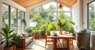
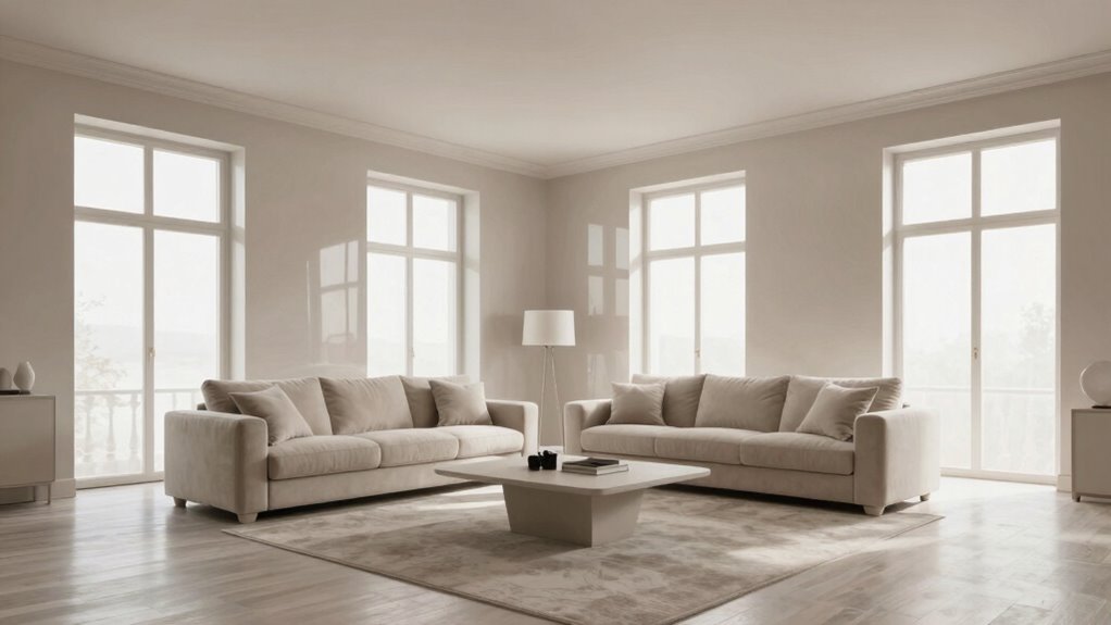
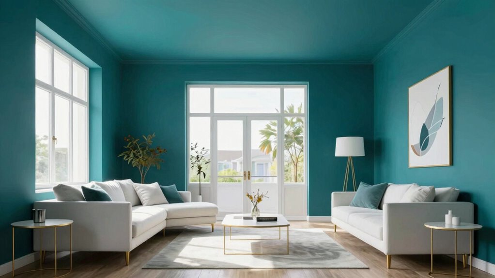
Have you ever wondered how a simple change in wall color can make a room feel bigger? It’s all about color psychology—lighter shades tend to open up space and create a sense of airiness. When choosing paint, consider finishes like matte or eggshell, which reflect light softly without glare, enhancing the perception of spaciousness. Glossy finishes might add shine but can make a room feel smaller or more confined due to their reflectiveness. By selecting colors that evoke calm and openness, you’ll help your space appear larger. Light hues such as soft blues, pale grays, or gentle beiges work best. Combining these with the right paint finish amplifies the effect, making your room feel more expansive and inviting. color psychology plays a crucial role in how our minds perceive space and size. Additionally, understanding how visual perception influences spatial awareness can further optimize your decorating choices, especially when considering how perception of space is affected by color choices. Engaging with these concepts allows you to harness the power of spatial illusions to create a more open and inviting environment.
Why Light and Color Influence Room Size Perception
Light and color play an essential role in how we perceive the size of a room; brighter and lighter shades make spaces feel more open and expansive. This is rooted in color psychology and the way room lighting influences our perception. Lighter hues reflect more light, creating an airy, spacious vibe, while darker shades absorb light, making a room feel smaller. Proper room lighting enhances these effects, emphasizing the psychological impact of color. To evoke emotion, consider this table:
| Bright, Light Colors | Darker, Deep Colors |
|---|---|
| Feelings of freedom | Feelings of coziness |
| Visual openness | Intimate atmosphere |
| Enhanced spaciousness | Reduced clutter perception |
| Fresh, clean vibe | Warm, inviting mood |
Understanding this interplay helps you craft rooms that feel bigger and more welcoming. Curiosity about color psychology can deepen your appreciation for design choices and their effects on space perception. Additionally, incorporating lighting techniques can further enhance the perception of space in your room. Recognizing how perception of room size is influenced by visual elements allows you to make more strategic design decisions. Exploring visual perception principles can provide further insights into optimizing room design, especially through understanding how light reflection impacts spatial awareness.
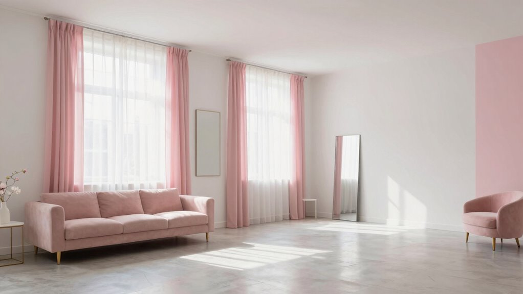
Choosing the Best Light-Hued Colors for Walls and Decor

Choosing the right light-hued colors for walls and decor can transform your space into an open, airy retreat. Light colors like soft blues, gentle greens, or warm beiges leverage color psychology to evoke calmness and spaciousness. When selecting paint finishes, opt for matte or eggshell textures, as they diffuse light better and reduce glare, enhancing the room’s openness. Satin or semi-gloss finishes reflect more light, which can also make a space feel larger, but they might emphasize imperfections. Focus on hues that have a subtle undertone, avoiding overly dark or saturated shades. These choices create a seamless flow, making your room appear bigger and more inviting. Remember, the right combination of color and finish can subtly influence perception and amplify your space’s size. Additionally, understanding color psychology can help you choose shades that enhance the desired mood and sense of openness.
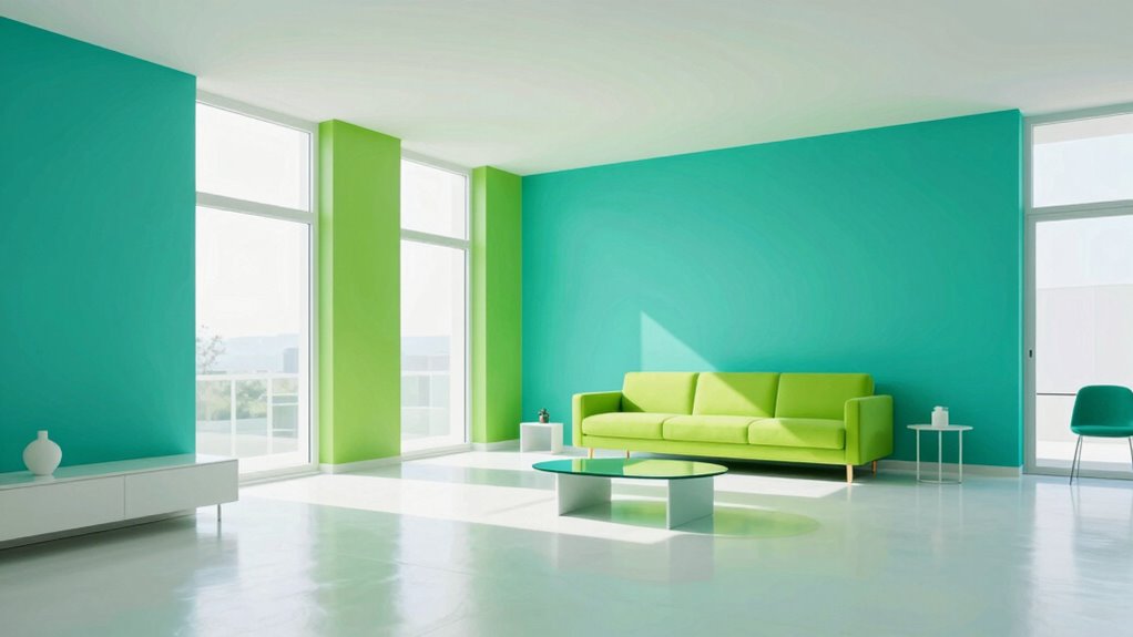
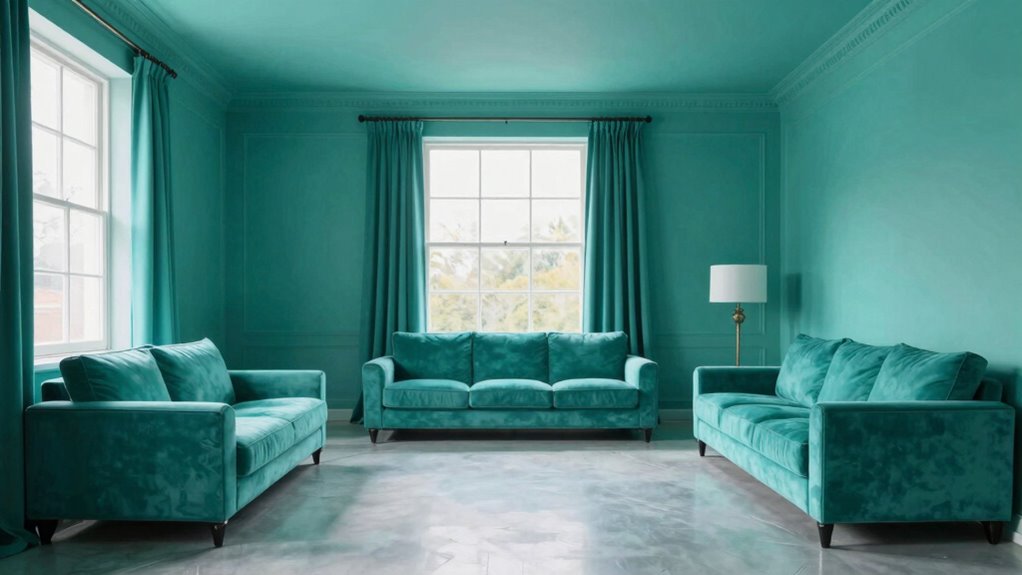
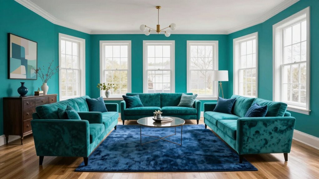
Using Monochromatic Color Schemes to Expand Space
Using monochromatic color schemes is an effective way to make a space feel larger and more cohesive. By sticking to shades of a single hue, you create monochromatic harmony that blurs boundaries and adds depth. Color blocking with varying tones enhances visual interest without clutter, tricking the eye into perceiving more space. Here’s how different shades work together:
| Light Shades | Dark Shades |
|---|---|
| Reflect more light, making the room feel airy | Add depth and dimension |
| Create a seamless flow | Highlight architectural details |
This technique minimizes contrast, reducing visual fragmentation and expanding perceived space. Incorporating color contrast techniques can further optimize the effect and create a balanced visual environment. Additionally, subtle variations in hue and saturation help maintain visual harmony and prevent the space from appearing flat or monotonous. Using color shading effectively ensures a harmonious and spacious feel in any room.
Applying Color Drenching in Small or Low-Ceiling Rooms
When working with small or low-ceiling rooms, applying color drenching can dramatically transform the space by creating an immersive and cozy atmosphere. To maximize this effect, consider these strategies:
- Use light, neutral shades to reflect more light and make the room feel larger.
- Incorporate soft, monochromatic palettes for a seamless, expansive look.
- Play with subtle color contrast to add depth without overwhelming the space.
- Leverage color psychology by choosing hues that evoke calm and openness, like blues or greens.
Common Mistakes to Avoid When Using Color to Make Rooms Look Bigger

Avoid overusing bright colors, as they can make a space feel chaotic rather than expansive. Pay attention to light balance; neglecting it can cause colors to look dull or overwhelming. Also, consider room proportions—using color without regard for size can lead to unbalanced, less inviting spaces. Incorporating household organization techniques can help maintain a cohesive and harmonious visual flow. Additionally, understanding inclusive casting principles can promote a more balanced and universally appealing environment. Being mindful of color psychology can further enhance the perception of space and comfort within a room. Exploring Free Floating design elements can also contribute to a more open and airy feel. Recognizing spatial perception concepts can further improve the effectiveness of your color choices in room design.
Overusing Bright Colors
Bright colors can make a room feel lively and spacious, but overdoing it can backfire. Too much color saturation overwhelms the eye, making the space feel cluttered rather than expansive. To avoid this mistake, keep these tips in mind:
- Limit bright hues to accent walls or accessories, not every surface.
- Balance vibrant colors with neutral tones to reduce excessive color contrast.
- Use a consistent color palette to maintain harmony and prevent visual chaos.
- Be cautious with high contrast combinations, which can make a room feel smaller or chaotic.
- Incorporate interior design basics such as mood boards to plan effective color schemes and ensure balanced application.
- Paying attention to color saturation levels helps prevent colors from becoming overpowering and keeps the room feeling open.
- Managing visual weight in color choices ensures the space remains light and airy rather than heavy and enclosed.
- Understanding perceived spaciousness through color application can further help in making rooms appear bigger and more inviting.
Overusing bright colors diminishes their impact, making the room feel busy instead of open. Properly controlling color saturation and contrast helps your space look bigger without overwhelming it.
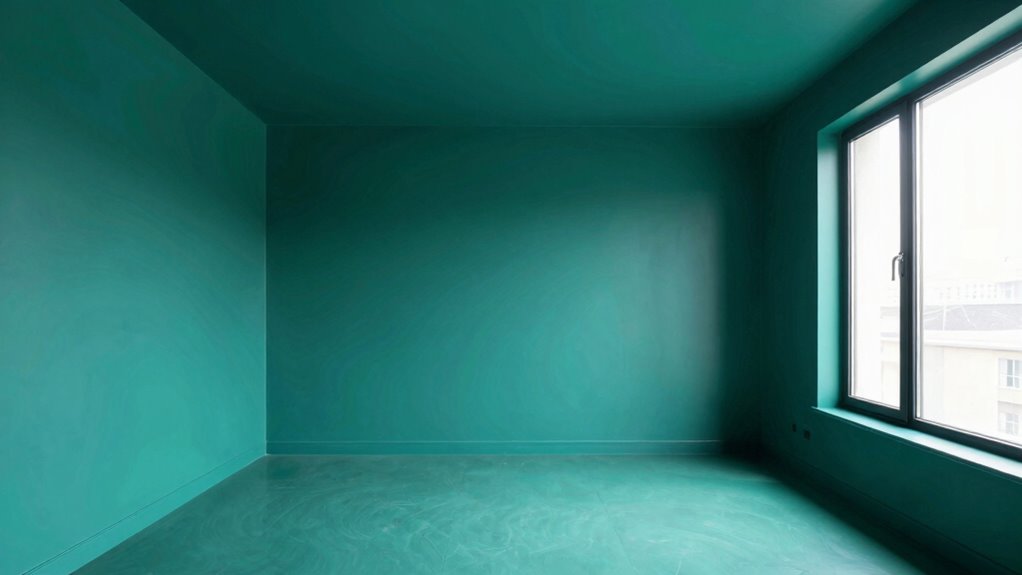
Ignoring Light Balance
If you ignore the balance of natural and artificial light in a room, your color choices can backfire, making the space appear smaller rather than larger. Proper lighting effects are essential for enhancing your color palette and creating a sense of openness. Bright, well-lit rooms amplify light colors, making walls feel expansive, while poor lighting can dull or distort your chosen hues. Pay attention to color contrast; high contrast between wall colors and lighting can create shadows that shrink the space visually. Conversely, soft, even lighting reduces harsh shadows and highlights, helping lighter or neutral tones to reflect more light. Additionally, understanding how lighting impacts color perception can help you select the right setup for a more spacious feel. Being aware of regional color influences can also guide you in choosing hues that naturally enhance the room’s openness. Using diffused lighting techniques can further soften shadows and distribute light evenly, enhancing the perception of space. Incorporating appropriate light placement can also minimize dark corners and maximize light distribution, making your room appear larger. Furthermore, adjusting light color temperature can significantly influence how your chosen colors are perceived, impacting the overall spaciousness. By balancing lighting effects and color contrast, you ensure your colors boost the room’s perceived size instead of diminishing it.
Neglecting Room Proportions
Neglecting room proportions when choosing colors can undermine your goal of making a space feel larger. If you ignore the room’s size and shape, you risk creating a spatial imbalance that emphasizes its limits instead of expanding it. To avoid this, consider these pitfalls:
- Using dark or intense colors in small rooms, which can make them feel cramped.
- Selecting overly light shades for large spaces, causing lack of definition.
- Ignoring ceiling height, making low ceilings feel even lower with heavy hues.
- Failing to balance wall, floor, and ceiling colors to maintain harmonious proportions.
- Overlooking the importance of architectural details such as door swings and stair proportions that influence perceived space.
Real-Life Examples of Color Drenching Transformations
Seeing real-life color drenching make over spaces can be inspiring. A bright blue bedroom, a warm gray living room, or a bold red kitchen all showcase how vibrant shades transform a room’s vibe. These examples prove how powerful color drenching can be in creating striking, personalized spaces.
Bright Blue Bedroom Makeover
A bright blue bedroom makeover instantly transforms a space into a lively, invigorating retreat. This color’s psychology promotes calmness and focus, making your room feel both expansive and serene. When choosing your paint, consider a satin or semi-gloss finish to add subtle reflection, amplifying the sense of space. Here are four key tips for success:
- Select a vibrant, yet balanced blue shade to avoid overpowering the room.
- Use high-quality paint with a smooth, even finish for a polished look.
- Incorporate white or neutral accents to enhance brightness.
- Add layered lighting to maximize the blue’s energizing effect.
This approach makes your bedroom feel larger, more inviting, and perfectly tailored to your mood.
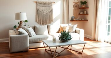
Warm Gray Living Room
Transforming a living room with warm gray paint can create a sophisticated, cozy atmosphere that feels both inviting and modern. Warm gray is versatile, appealing to different color psychology by balancing calmness with subtle warmth, making the space feel welcoming yet tranquil. The key to maximizing this effect lies in choosing the right paint finish—matte or eggshell finishes soften the room’s appearance, adding depth and reducing glare. When you drench the walls in warm gray, you create a neutral backdrop that complements various furniture styles and accent colors, enhancing the room’s sense of spaciousness. This color, with its understated elegance, encourages relaxation and socializing, making your living room a true retreat.
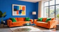
Bold Red Kitchen Refresh
Drenching a kitchen in bold red instantly creates a striking, energetic atmosphere that energizes the entire space. This color psychology choice stimulates appetite and conversation, making your kitchen feel lively and inviting. To maximize impact, consider these key elements:
- Use a high-gloss paint finish for a sleek, reflective surface that enhances vibrancy.
- Pair red walls with neutral cabinetry to balance the intensity.
- Incorporate warm metallic accents to complement the bold hue.
- Keep accessories minimal to avoid overwhelming the space.
A bold red kitchen refresh transforms your environment into a dynamic, memorable area. The right paint finish amplifies the color’s effect, ensuring your design feels cohesive and intentional. This daring choice proves how powerful color drenching can be in making a space feel bigger and more energized.
Quick Tips to Start Using Color Drenching in Your Home
Getting started with color drenching is easier than you might think. Begin by choosing a bold hue that resonates with your mood or the atmosphere you want to create, keeping color psychology in mind. Don’t be afraid to test different shades on your walls before committing. When selecting paint finishes, opt for eggshell or satin for a subtle sheen that enhances depth without glare, or go matte for a sophisticated look. Lightly tape off areas to experiment with color placement and avoid messy edges. Remember, consistency is key—cover large surfaces evenly to amplify the room’s sense of space. With these quick tips, you’ll be on your way to transforming your home into a vibrant, spacious haven using color drenching.
Frequently Asked Questions
Can Color Drenching Work in Rooms With High Ceilings?
Yes, color drenching works well in rooms with high ceilings. It creates a ceiling illusion that balances the space, making it feel more cozy and proportionate. By using a darker hue on the walls, you enhance color depth and draw attention downward. This technique visually reduces the height, making your room feel more inviting without sacrificing the grandeur of high ceilings.
How Does Natural Light Affect Color Drenching Effectiveness?
Natural light greatly enhances color drenching, making the colors appear more vibrant and saturated. When your room receives ample sunlight, the colors will look richer and more dynamic, amplifying the illusion of spaciousness. Conversely, limited natural light can dull the effect, so you might need to adjust the paint or add artificial lighting. To maximize impact, guarantee your space gets plenty of sunlight for the best color saturation.
Is Color Drenching Suitable for All Interior Styles?
You’ll find that color drenching suits most interior styles, including bold color and minimalist styles, as it’s a versatile technique. Notably, 78% of designers say this method transforms spaces profoundly. If you love vibrant or subdued palettes, color drenching can create a cohesive, expansive look. It’s especially effective if you want to make a bold statement or keep things simple. So, yes, it’s suitable for almost any interior style you prefer.
What Are the Best Tools for Applying Color Drenching?
You’ll want a variety of tools for applying color drenching effectively. Use high-quality paint brushes for detailed edges, roller frames for smooth walls, and paint sprayers for rapid coverage. Masking tape and painter’s tape help create clean lines and protect surfaces. Opt for a sprayer if you’re covering large areas quickly, while brushes and rollers are perfect for more controlled application. Combining these tools guarantees a seamless, professional finish.
How Long Does It Take to See the Full Effect of Color Drenching?
You’ll typically see the full effect of color drenching within a few days, but keep in mind that paint drying can take up to 24 hours, and initial color fading might occur as the paint settles. For the best results, wait about a week to assess the true, vibrant look. Be patient, as rushing can affect the final appearance and longevity of your color-filled room.
Conclusion
Ready to transform your space? With the right color drenching techniques, you’ll see your rooms feel bigger and brighter than ever before. But there’s more to it than just choosing light hues—you’ll need to master the subtle tricks that truly make a difference. Curious about which colors and methods will work best for your home? Stay tuned, because the next step could be the game-changer you’ve been waiting for. The secret to a stunning, spacious room is closer than you think.