To use bold colors like a pro and boost dopamine without chaos, start by choosing hues that match the mood you want—energizing or calming—and balance them with neutral tones. Test colors first and add them through accessories, art, or focal walls rather than overwhelming the entire space. Focus on creating harmony through color coordination, contrast, and cultural elements, and avoid clutter to keep your space lively yet peaceful. Keep exploring for more tips to master this art.
Key Takeaways
- Balance bold colors with neutral tones to create harmony and prevent visual chaos.
- Limit bold hues to focal areas and complement with softer shades for cohesion.
- Test color samples and use accessories to gradually introduce vibrant shades confidently.
- Use color blocking and strategic placement to direct attention and add visual interest.
- Incorporate cultural and artistic elements to deepen connection and enhance aesthetic harmony.
The Psychology of Bold Colors in Interior Spaces
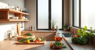
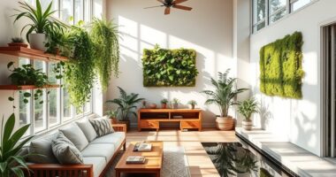
Bold colors in interior spaces can markedly influence your mood and energy levels, often in ways you might not realize. This is the core of color psychology—the study of how hues affect your emotions. Bright reds and oranges can boost your energy and create a sense of excitement, making them perfect for lively areas. Conversely, calming blues and greens promote relaxation and focus, ideal for bedrooms or workspaces. The emotional impact of bold colors isn’t just about aesthetics; it shapes how you feel and behave in a room. When you choose bold hues intentionally, you can evoke specific feelings and set the tone for each space. Understanding this psychological connection helps you craft environments that uplift, energize, or soothe, depending on your needs. Incorporating natural light further enhances the positive effects of color, creating a harmonious and wellness-focused environment. Additionally, color consistency across a space can strengthen these emotional effects and create a more cohesive atmosphere. Recognizing the role of visual harmony can help you design spaces that feel balanced and inviting. Moreover, considering architectural details can amplify the psychological impact of bold colors by guiding how they are perceived within the space. Incorporating knowledge about contrast and balance can also enhance the overall mood and aesthetic appeal of your interior design.
How to Choose the Perfect Bold Hue for Your Home
Choosing the right bold hue for your home begins with considering the mood you want to create in each space. Start with shade selection by identifying colors that evoke the feelings you desire—energetic reds, calming blues, or vibrant yellows. Once you’ve narrowed down your options, focus on color matching to guarantee the bold hue complements existing elements. Think about how the shade interacts with natural light and nearby furniture or decor. Test different shades in small areas before committing to large walls, so you can see how they influence the room’s atmosphere. Remember, the goal is to select a hue that energizes without overwhelming, creating a cohesive look that reflects your personality. This deliberate approach assures your bold color choice enhances your space beautifully.
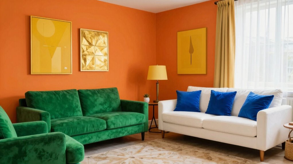
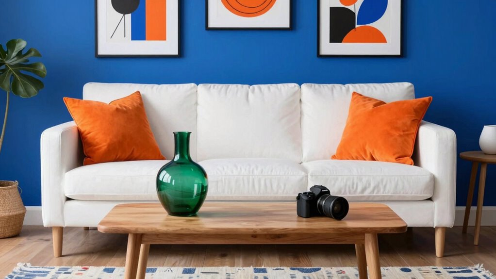
Balancing Bold Colors With Neutral and Calm Elements

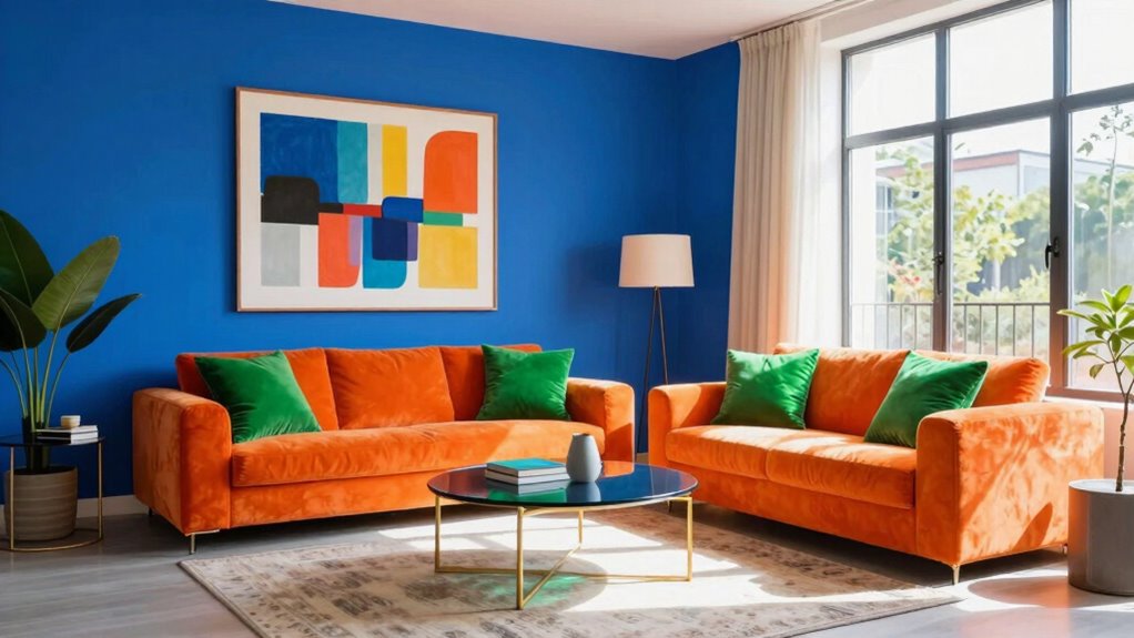
Pairing strong, vibrant hues with neutral and calming elements helps create a balanced and inviting space. To achieve this, consider adjusting color saturation; use bold colors sparingly or in smaller doses to prevent overwhelming the room. Incorporate accent neutral tones—like soft beiges, warm grays, or muted whites—through furniture, textiles, or accessories. These neutral elements act as a visual rest, grounding the space and allowing the bold hues to stand out without dominance. Additionally, understanding ethics in consumer choices can help you select environmentally friendly paints or sustainable decor options, promoting responsible decorating practices. Being mindful of environmentally friendly options ensures your decorating choices align with sustainable practices. Supporting natural pool designs and eco-friendly landscaping can further enhance your backyard’s harmony with nature. Incorporating sustainable decorating practices supports eco-conscious decisions and reduces environmental impact. Practicing eco-friendly decorating can also help in reducing your overall carbon footprint. By thoughtfully blending high-saturation colors with understated neutral accents, you maintain energy and excitement while fostering a calm, cohesive atmosphere. This balance ensures your space feels lively yet comfortable, making bold colors a source of joy rather than chaos.
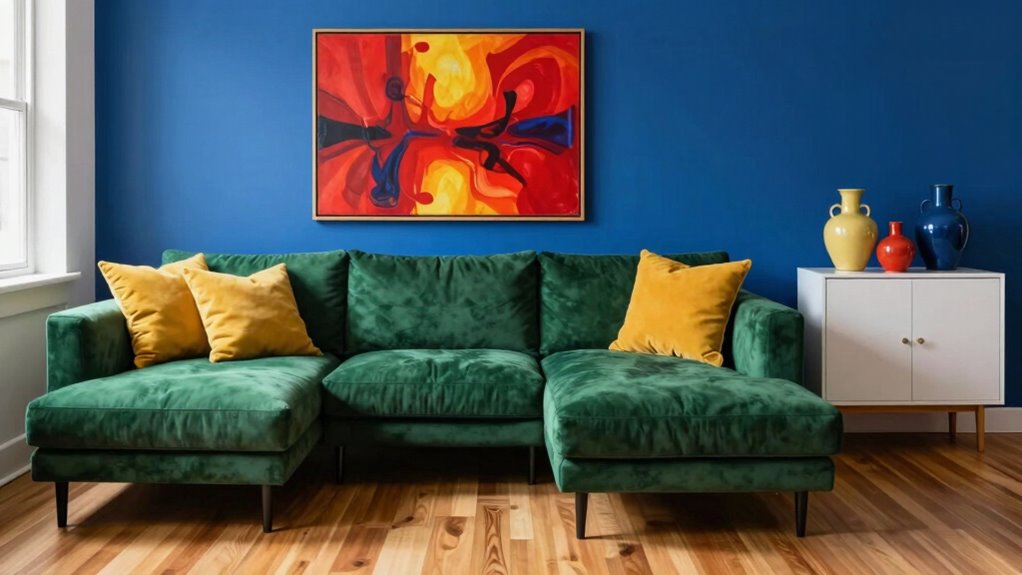
Creating Focal Points With Bold Colors Without Overwhelming
You can create striking focal points by placing bold colors strategically where they catch the eye. Balancing color intensity guarantees the space feels lively without becoming overwhelming. Using placement techniques and varied shades helps highlight features without losing harmony. Incorporating color balance techniques ensures your bold-colored accessories remain vibrant and well-maintained over time. Additionally, understanding how light and shadow influence color perception can help maintain the desired vibrancy and prevent colors from appearing dull or too harsh. Being mindful of psychological effects of color can also enhance the overall ambiance and mood of your space, making it more inviting and energizing. Considering cabling and installation options can help ensure that your decor remains clutter-free and visually appealing, supporting a cohesive design aesthetic.
Strategic Placement Techniques
To create focal points with bold colors without overwhelming your space, strategic placement is key. Start with color blocking by grouping bold hues in specific areas to draw attention, like a vibrant section on a wall or a console table. Use accent wall techniques to highlight a single wall with a striking color, creating a visual anchor without saturating the entire room. Keep the surrounding decor neutral or subdued to let the bold color stand out. Focus bold shades on areas where you want to create impact, such as behind a sofa or in a niche. By thoughtfully placing your colors, you guide the eye naturally and prevent the space from feeling chaotic. Remember, less is more—intentional placement makes bold colors work beautifully. Incorporating strategic placement techniques can also enhance your overall design by balancing bold hues with visual harmony and functional aesthetics. Paying attention to color psychology can further refine your choices, ensuring your bold colors evoke the desired mood and atmosphere. Additionally, understanding how auditory processing techniques can improve communication may inspire a mindful approach to balancing sensory elements in your environment.
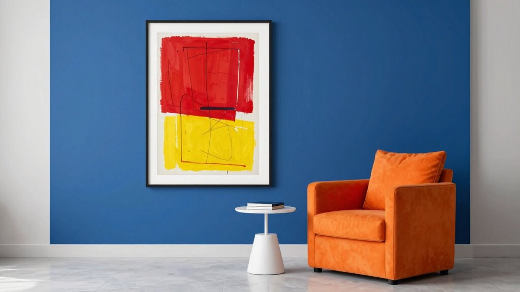
Balancing Color Intensity
Achieving a striking focal point with bold colors requires carefully balancing their intensity to avoid overwhelming the space. You can do this by managing color contrast and adjusting saturation levels, ensuring the focal area commands attention without dominating the room. Use high saturation sparingly—perhaps on a single accent wall or decor piece—while keeping surrounding elements more subdued. Incorporate softer hues nearby to create harmony and prevent visual fatigue. Remember, subtle shifts in saturation levels can soften or emphasize bold hues, guiding the eye naturally. To maintain balance:
- Limit bold colors to one or two areas for impact
- Use neutral tones to offset intense hues
- Play with varying color contrast to highlight focal points
- Keep surrounding elements less saturated to avoid clutter
- Control color contrast to enhance visual balance and focus
Implementing color harmony principles can further help in achieving a cohesive and visually appealing space. Additionally, understanding color psychology can assist in selecting hues that evoke the desired mood and harmony within your decor. Being mindful of visual weight helps distribute color in a way that feels balanced and intentional.
Incorporating Bold Colors Through Accessories and Art

Adding bold colors through accessories and art instantly energizes a space without overwhelming it. To achieve this, focus on creating striking color contrast between your accessories and the background. For example, pair vibrant artwork with neutral furnishings or vice versa. Accessory layering also plays a vital role; combine different textures, sizes, and shapes to add depth and interest. Use bold-colored throw pillows, vases, or decorative objects to make a statement without cluttering the room. When selecting art, choose pieces that resonate with your color palette, acting as focal points. Keep balance in mind—don’t go overboard with too many bold elements at once. Instead, strategically place accessories and artwork to highlight your chosen color accents, making your space lively yet harmonious. Incorporating visual harmony helps prevent chaos and supports work-life balance by creating a calming environment. Additionally, utilizing color contrast effectively enhances visual interest and prevents the space from feeling cluttered. Being mindful of color coordination ensures a cohesive and polished look across your decor. Incorporating culturally inspired indigenous design elements, such as Noongar or Koori patterns, can also add meaningful depth and connection to your space.
Common Mistakes to Avoid When Using Bold Colors
Using too many bright colors at once can overwhelm your space and create chaos. You might also neglect balance and harmony, making the room feel disjointed. Remember to think about the room’s function to ensure your bold choices enhance, rather than hinder, its purpose.
Overusing Bright Colors
While bold colors can make a space lively and engaging, overdoing them can quickly create visual chaos. Using too many bright hues can overwhelm a room, making it feel cluttered and unbalanced. Instead of mixing every bold color, consider sticking to a monochrome scheme or mellow pastel palettes to create harmony without sacrificing excitement. When you overuse bright colors, you risk losing the impact of each one and creating a distracting environment. To avoid this, limit your bold color choices and use neutral tones to ground the space. Remember, moderation is key to maintaining a stylish, energetic look. By controlling your color palette, you’ll keep your decor vibrant but not chaotic, making every bold choice count.
Ignoring Balance and Harmony
Ignoring balance and harmony can quickly turn a room with bold colors into a jarring visual experience. When you neglect proper color coordination, your space may feel chaotic rather than lively. Focus on creating visual symmetry by balancing vibrant hues with neutral tones or softer shades. Avoid clustering all bold colors in one area; instead, distribute them evenly to maintain harmony. Use repeating patterns or complementary colors to tie different elements together seamlessly. Without this balance, your room might overwhelm instead of energize, causing discomfort rather than delight. Remember, bold colors should enhance your space, not dominate it. Aspire for a cohesive look where each element supports the overall design, ensuring your daring decor feels intentional and visually pleasing.
Neglecting Room Function
When you choose bold colors without considering how you’ll actually use the space, your room can quickly become impractical and less inviting. Neglecting room function and proper space planning can lead to a décor that looks stunning but doesn’t serve your needs. Before selecting bold hues, think about the room’s purpose. For example, vibrant colors might energize a living room but overwhelm a bedroom meant for relaxation. Proper space planning ensures your color choices enhance functionality.
- Assess the room’s primary use before choosing colors
- Balance bold hues with functional furniture placement
- Use calmer tones in high-traffic or restful areas
- Consider lighting to make bold colors work for the purpose
This approach keeps your space both beautiful and practical.
Practical Tips to Decorate With Bold Colors Confidently

Decorating with bold colors can feel intimidating, but approaching it with confidence makes all the difference. Start by experimenting with color blocking—combine large swaths of contrasting hues to create striking focal points. It’s a great way to test how different shades interact without overwhelming the space. Before committing, do paint sampling on your walls; this allows you to see how the colors look in your lighting and alongside existing decor. Keep in mind, bold doesn’t mean chaotic—balance your palette with neutral tones or calming accents. Trust your instincts and take small steps, like adding colorful accessories or artwork, to build confidence. Remember, bold decor is about expressing personality, so enjoy the process and celebrate your unique style.
Frequently Asked Questions
How Can I Incorporate Bold Colors Into Small Spaces Effectively?
You can incorporate bold colors into small spaces by using color blocking to create visual interest without overwhelming the room. Focus on painting an accent wall in a vibrant hue to add impact while keeping the rest of the space neutral. This technique emphasizes the bold color, making the room feel lively without feeling cluttered. Balance the look with simple furniture and minimal decor to maintain harmony and prevent chaos.
What Are the Best Lighting Options to Enhance Bold Color Decor?
Irony alert: the best lighting to showcase bold colors isn’t fancy fixtures but natural illumination. You should maximize sunlight with sheer curtains or strategically placed windows. For evening, choose modern lighting fixtures like dimmable LEDs or warm-toned bulbs that highlight your vibrant decor without overwhelming it. Combining natural and artificial light creates a dynamic environment, making your bold colors pop while adding a cozy, curated feel to your space.
How Do I Maintain a Cohesive Style With Multiple Bold Hues?
To maintain a cohesive style with multiple bold hues, focus on color harmony by choosing shades that complement each other. Use a neutral base to create visual balance, allowing your vibrant colors to stand out without overwhelming the space. Incorporate consistent patterns or textures, and limit the number of bold hues to prevent chaos. This approach keeps your decor lively yet harmonious, making your space feel intentional and stylish.
Can Bold Colors Influence Mood Positively in a Home Setting?
Like Van Gogh’s vibrant strokes, bold colors can boost your mood through color psychology, positively influencing your home environment. They create an energetic and inspiring atmosphere, enhancing your overall well-being. By thoughtfully choosing and balancing these hues, you can harness their mood enhancement benefits without overwhelming your space. Embrace bold colors to energize, uplift, and bring a sense of joy into your home, transforming it into a sanctuary of positivity.
What Are Quick Ways to Update Decor With Bold Colors Seasonally?
You can quickly update your decor with bold colors by switching out seasonal accents like pillows, throws, or vases that match your color palette. Add vibrant artwork or bold curtains for an instant refresh. Incorporate seasonal accessories in striking hues to keep your space lively and aligned with the season. These simple swaps create a fresh, energetic vibe without overhauling your entire decor.
Conclusion
By mastering the art of using bold colors, you can turn your home into a vibrant canvas that sparks joy without chaos. Think of your space as a symphony, where each color plays a essential note. With confidence and balance, you’ll create a lively sanctuary that energizes and relaxes in perfect harmony. Embrace your inner designer, and let bold hues be your secret weapon for a stunning, harmonious home.