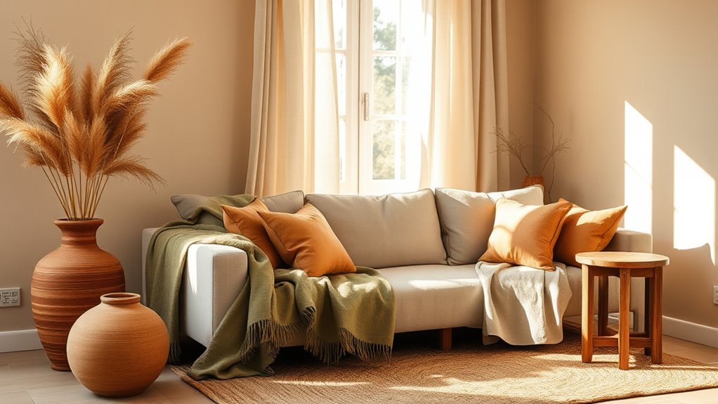
For 2025–2026, warm neutrals and earthy tones will dominate color trends, emphasizing comfort, authenticity, and connection to nature. Expect a palette inspired by sandy beiges, muted browns, soft greens, and terracotta shades rooted in global cultures. These versatile hues promote sustainability, calmness, and personal expression, making spaces feel grounded and timeless. By focusing on natural dyes and eco-friendly influences, these colors reflect values of authenticity and environmental consciousness. Keep exploring to discover how these shades can shape your aesthetic choices.
Key Takeaways
- Warm neutrals and earthy tones dominate 2025–2026, emphasizing comfort, authenticity, and natural connection across design sectors.
- Inspired by diverse cultures, colors like terracotta, ochre, and mossy green evoke heritage and global resonance.
- Sustainable dyeing methods favor eco-friendly shades such as clay reds, warm taupes, and muted greens for eco-conscious appeal.
- These versatile hues promote mindfulness, harmony, and a grounded aesthetic in interior, fashion, and branding designs.
- The trend reflects a shift toward simplicity, natural beauty, and cultural appreciation, fostering calming, timeless aesthetics.

What colors will define the next couple of years? As you look ahead to 2025–2026, you’ll notice a strong shift toward warm neutrals and earthy tones. These colors reflect a desire for comfort, authenticity, and a connection to nature. They’re not just trendy; they’re rooted in a movement toward sustainability and cultural awareness. You’ll find that sustainable color palettes are gaining prominence, emphasizing hues that are versatile, calming, and easy to incorporate into everyday life. These palettes often include shades inspired by natural landscapes—think sandy beiges, muted browns, and soft olive greens—that evoke a sense of grounding and stability.
Warm neutrals and earthy tones inspire sustainable, authentic, and calming color palettes rooted in nature and cultural diversity.
Cultural influences on color are playing a significant role in shaping these trends. As the world becomes more interconnected, designers and consumers alike are drawing inspiration from diverse traditions and environments. For example, warm terracotta shades might be inspired by Mediterranean architecture, while deep ochres can reflect African textiles. These influences help create a rich, layered palette that resonates on a global scale. You’ll notice that such colors are often used in interiors, fashion, and branding to evoke a sense of heritage and authenticity. They serve as a reminder that color can carry stories and cultural significance, making your choices more meaningful.
In choosing your own color schemes for the upcoming years, you’ll want to focus on sustainability. Opt for colors that can seamlessly blend with other shades, allowing you to build a cohesive, eco-conscious aesthetic. Many brands now prioritize natural dyes and environmentally friendly manufacturing processes, so the colors you select can also reflect your values. The appeal of warm neutrals and earthy tones is their versatility—they can be both understated and bold, depending on how you pair them. Think about incorporating clay-inspired reds, warm taupes, or mossy greens into your home or wardrobe to create a calming, timeless look.
These shades also encourage mindfulness in design. By embracing earthy tones, you’re aligning yourself with a movement that values simplicity, nature, and cultural depth. Whether you’re updating your living space or rejuvenating your wardrobe, these colors foster a sense of harmony and authenticity. They remind you that beauty doesn’t have to be flashy; it can be rooted in the natural world and the cultures that have shaped it. As you experiment with these hues, remember they’re more than just colors—they’re expressions of sustainability, cultural appreciation, and personal connection to the environment around you.
Frequently Asked Questions
How Do Warm Neutrals Impact Interior Lighting?
Warm neutrals impact your interior lighting by creating a cozy, inviting atmosphere. They enhance lighting scalability, making spaces feel more balanced and comfortable without harsh contrasts. Plus, their color temperature effects soften the glow, reducing glare and eye strain. As a result, your rooms appear warmer and more harmonious, encouraging relaxation and making your space feel more welcoming. You’ll enjoy a versatile ambiance that adapts effortlessly to different lighting conditions.
Can Earthy Tones Improve Mental Well-Being?
Earthy tones can improve your mental well-being by creating a calming environment that fosters mindfulness practices. These colors evoke emotional comfort, helping you feel more grounded and relaxed. When you surround yourself with warm, natural shades, you’re likely to experience reduced stress and enhanced mood, making it easier to focus on self-care and emotional balance. Incorporating earthy tones into your space supports your mental health effortlessly.
Are These Colors Suitable for Outdoor Spaces?
Like a cozy blanket on a cool day, warm neutrals and earthy tones create inviting outdoor spaces. They’re perfect for outdoor furniture design, blending seamlessly with natural surroundings, and enhancing your dining room decor when extended outdoors. These colors age gracefully and resist fading, making them ideal for outdoor use. So yes, you can confidently incorporate them into your outdoor spaces for a stylish, harmonious look.
How Do These Trends Influence Fashion Choices?
These trends influence your fashion choices by emphasizing color psychology and sustainability in fashion. You’re more likely to choose warm neutrals and earthy tones because they promote calmness and connection to nature. Plus, these colors often come from sustainable sources, helping you make eco-friendly choices. Wearing these shades helps you stay stylish while supporting environmentally conscious fashion, aligning your wardrobe with current trends and your values.
What Accessories Complement Warm Neutrals and Earthy Tones?
A picture is worth a thousand words, so choose accessories wisely. To complement warm neutrals and earthy tones, opt for layered textures like leather, woven fabrics, and suede to add depth. Statement jewelry, such as chunky necklaces or bold earrings, enhances the natural palette. These accessories create a harmonious look, making your outfit feel thoughtfully curated and effortlessly stylish while embracing the trend’s organic, grounded vibe.
Conclusion
As you embrace these warm neutrals and earthy tones for 2025–2026, imagine transforming your space into a calming retreat that reflects nature’s serenity. Picture a cozy living room where soft beiges and gentle browns create a welcoming atmosphere—just like a recent homeowner who found peace and inspiration through these colors. By choosing these trending shades, you’ll craft a timeless, cozy environment that nurtures your soul and welcomes everyone in.