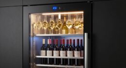
Retro ’70s style is making a comeback, and the vibrant color palette is key to nailing the look. Think bold oranges, sunny yellows, teals, fiery reds, electric blues, and earthy neutrals—all combine to create energetic, eye-catching outfits and stylish spaces. Pair bright hues with neutral tones or mix bold patterns for a true vintage vibe. Want to discover which shades suit your space or wardrobe? Keep exploring to uncover all the colorful secrets of ’70s style.
Key Takeaways
- The vibrant ’70s palette features bold hues like oranges, yellows, teals, and reds that create energetic, eye-catching fashion and decor statements.
- Earth tones such as browns, beiges, and terracottas serve as versatile, grounding neutrals for authentic vintage looks.
- Incorporating signature ’70s colors through accessories, furniture, and textiles enhances nostalgic style in both wardrobe and home decor.
- Bold patterns like geometric shapes, swirling florals, and psychedelic motifs amplify the retro aesthetic using vibrant color combinations.
- Modern reinterpretations balance vintage ’70s hues with sleek, minimalist designs for a contemporary-retro fusion that feels fresh and relevant.
What Are the Key ’70s Colors and Why Do They Stand Out?
The vibrant palette of the ’70s is what instantly defines its style, with colors that demand attention and evoke a sense of fun. These bold hues are rooted in color psychology, which explains why they evoke feelings of energy, optimism, and creativity. Think of bright oranges, sunny yellows, and punchy teals—colors that elevate any outfit or space. Vintage color matching was all about contrasting and complementing, creating dynamic combinations that stand out. You’ll notice how these colors aren’t subtle; they’re designed to make a statement. Color combinations played a key role in defining the era’s distinctive aesthetic, showcasing how deliberate pairing can enhance visual impact. Whether used in fashion, home decor, or accessories, these key colors reflect a carefree attitude and a desire to express individuality. This playful, eye-catching approach is what makes ’70s colors so memorable and enduring. color psychology helps us understand why these hues continue to resonate today.
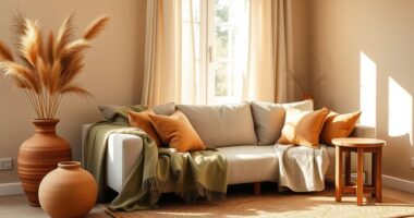
Earth Tones and Warm Neutrals That Define ’70s Style
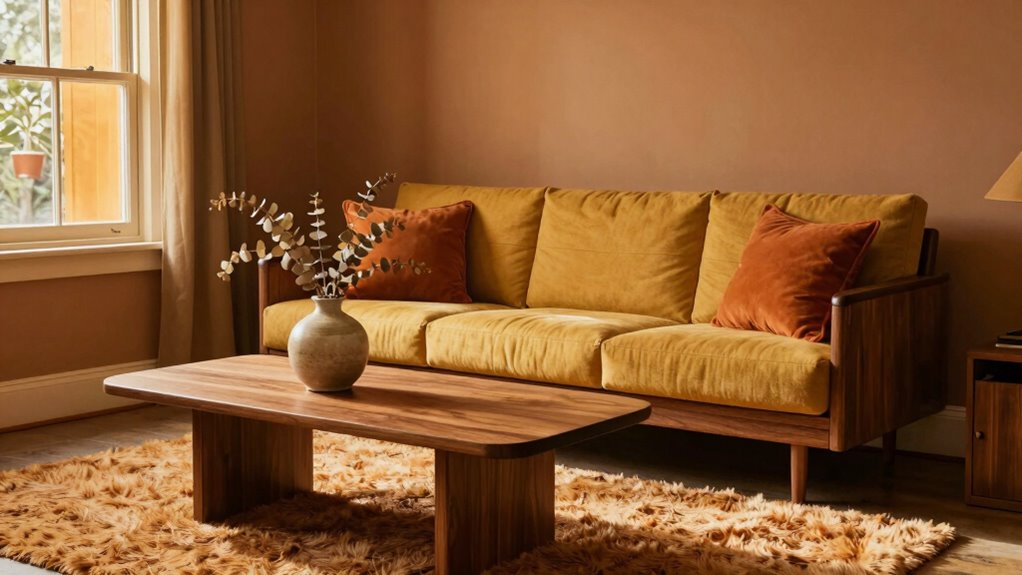
Earth tones and warm neutrals form the backbone of ’70s style, grounding its bold colors with a sense of natural simplicity. You’ll find these shades in vintage textiles, which often feature earthy browns, warm beiges, and soft terracottas. These hues create a cozy, inviting feel that’s perfect for authentic ’70s looks. Incorporate retro accessories like wooden jewelry, leather belts, or woven handbags in these shades to enhance your outfit. They serve as versatile foundation pieces, allowing you to mix and match with brighter accents or keep things understated. Whether you’re dressing up or down, these earth tones and neutrals add depth and warmth, making your vintage-inspired look both timeless and effortlessly stylish. Embracing minimalism highlights the importance of simplicity in design, ensuring your style remains elegant and clutter-free. Additionally, understanding color harmony can help you create balanced and visually appealing combinations within this earthy palette, especially when considering yarn weight and stitch type for texture and depth in your fashion or decor choices. Incorporating natural materials can further enhance the authentic ’70s vibe, emphasizing sustainability and tactile richness. Incorporating these foundational shades can also serve as a base for experimenting with brighter retro accents, allowing for versatile styling options.
Bright and Bold: Vibrant Hues for a Retro Vibe
Vibrant hues are the heart of authentic ’70s style, injecting energy and personality into any retro-inspired look. Think about vintage car colors like fiery reds, electric blues, and sunny yellows that instantly grab attention. These bold shades also translate perfectly into retro makeup shades, like hot pinks, shimmering oranges, and deep purples, making your look stand out. Bright and bold colors push your style into the spotlight, giving you that unmistakable ’70s flair. Don’t be afraid to mix and match these lively hues—combine a vivid jacket with colorful accessories or a striking makeup palette. When you embrace vibrant hues, you channel the free-spirited, energetic vibe of the ’70s, making your style both nostalgic and undeniably fresh. Incorporating retro color palettes can further enhance the authenticity of your look. Exploring authentic vintage color trends can help you craft a truly compelling retro ensemble. Additionally, understanding color psychology can guide you in selecting shades that evoke the desired mood and attitude of the era.
How to Incorporate ’70s Colors Into Your Wardrobe
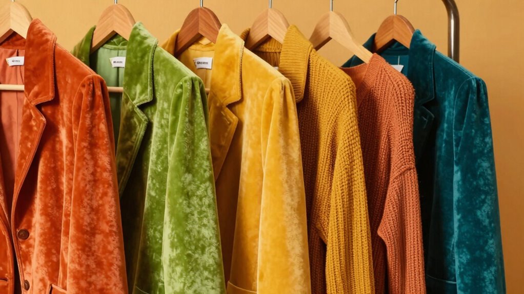
To bring the bold ’70s color palette into your wardrobe, start by selecting key pieces in those signature hues. Think vibrant jackets, flowing skirts, or statement tops in shades like avocado green, mustard yellow, or burnt orange. These colors work well with vintage accessories, such as retro sunglasses or chunky jewelry, to complete your look. Incorporate ’70s-inspired elements like wide-leg pants or patterned blouses to add authenticity. For a cohesive style, consider coordinating your outfit with subtle touches of color that echo vintage dining decor, like amber accents or warm earth tones. Don’t forget, mixing and matching these hues with neutral basics keeps the look fresh without overwhelming. Understanding color palette principles can help you balance bold hues effectively. Exploring retro fashion trends can provide inspiration for authentic styling choices. Additionally, paying attention to multi-color coordination techniques can enhance your overall vintage-inspired ensemble. Knowing how to incorporate vintage color schemes into modern outfits can make your look more cohesive and stylish. To refine your styling skills, studying color matching techniques can be especially helpful. With these tips, you’ll effortlessly channel ’70s style and make a bold, nostalgic statement.
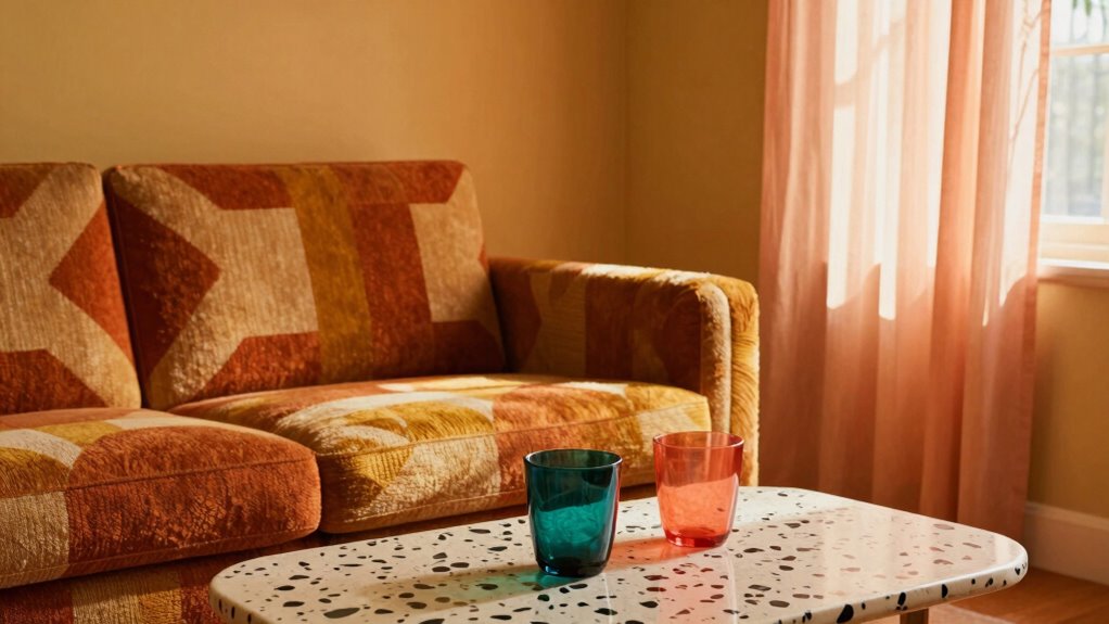
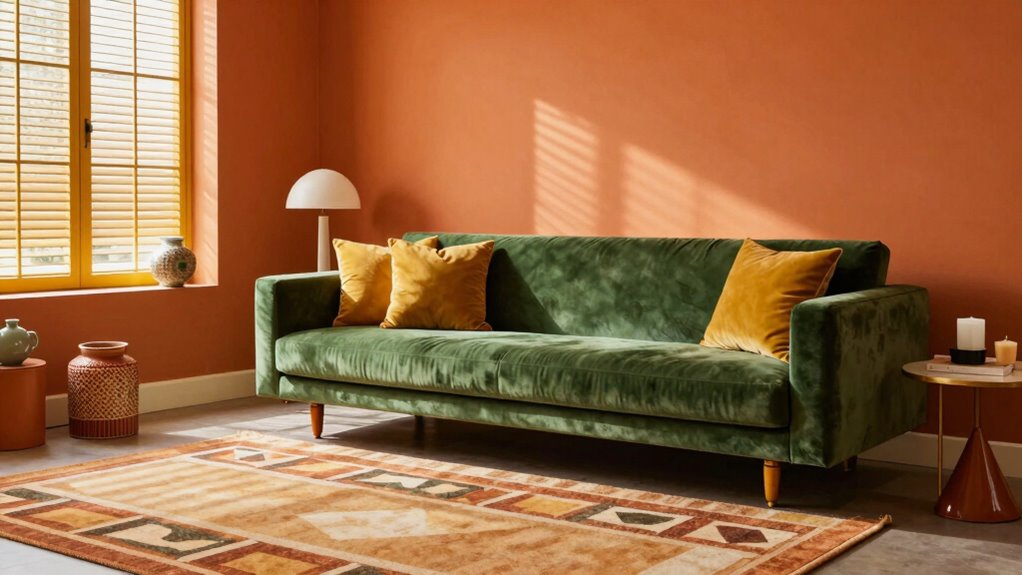
Refresh Your Home Decor With Classic ’70s Color Schemes

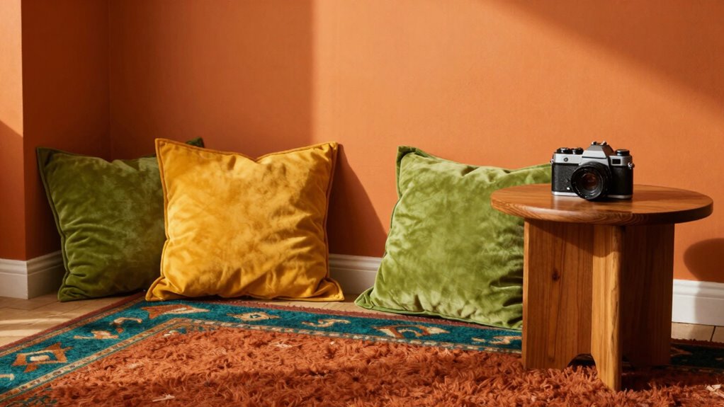
You can instantly update your space by incorporating warm earth tones like terracotta and olive green. Add bold accent colors such as mustard yellow or orange to create striking focal points. Don’t forget to embrace retro patterns to bring a playful, nostalgic vibe to your decor. For a cohesive look, consider using color matching techniques to ensure your palette is perfectly balanced. Additionally, integrating classic ’70s color palettes can help you achieve an authentic retro feel that’s both vibrant and harmonious.
Warm Earth Tones
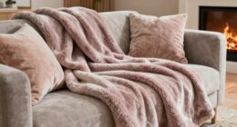
Warm earth tones are making a stylish comeback, giving your home a cozy and timeless feel. These nature-inspired palettes feature earthy mineral shades that evoke a sense of calm and grounding. Think rich terracotta, warm ochre, and soft mocha—colors that bring warmth and depth to any space. Incorporating these hues creates a welcoming atmosphere, perfect for a retro ’70s vibe. You can use them on walls, furniture, or accents, blending seamlessly with wood finishes and natural textures. The beauty of warm earth tones lies in their versatility—they complement a variety of styles while adding a nostalgic touch. By choosing these shades, you embed a sense of nature’s tranquility into your decor, making your home both stylish and inviting. Additionally, understanding how contrast ratio impacts image quality can help you create a more immersive home cinema experience that complements your retro aesthetic.
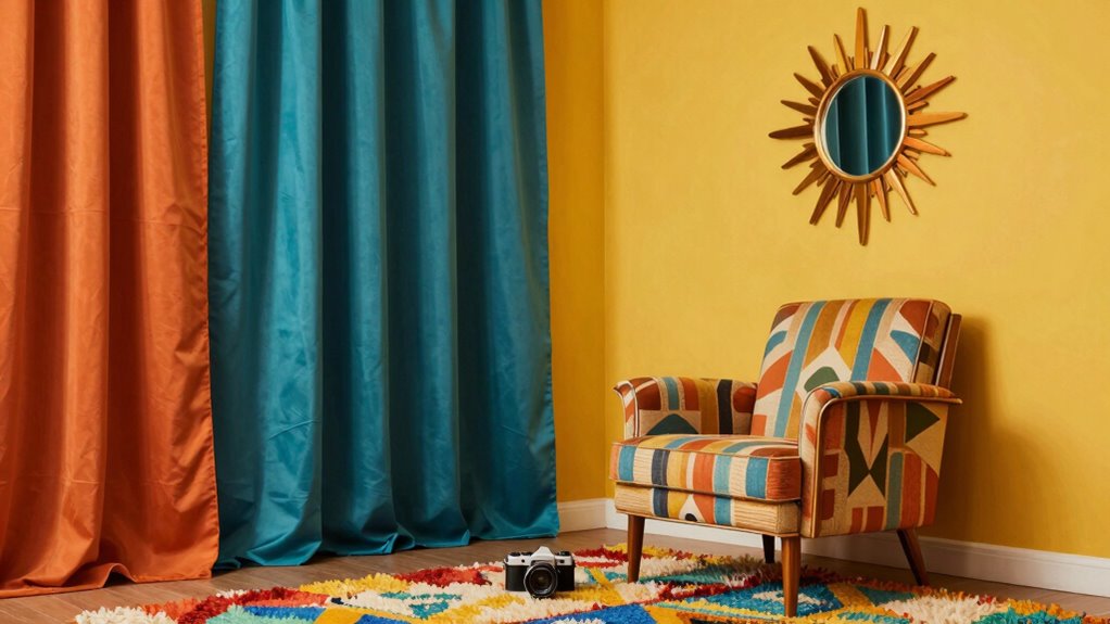
Bold Accent Colors
Have you considered infusing your space with bold, vibrant colors inspired by the ’70s? These accent hues can instantly energize your decor and reflect the confident spirit of the era. Using color psychology, you can pick shades like fiery oranges or deep reds to evoke passion and warmth. To stay on-trend, incorporate these accents strategically:
- Paint a single wall in a rich, bold hue to create a focal point.
- Add colorful throw pillows or rugs that pop against neutral backgrounds.
- Use vibrant vases or art pieces to introduce splashes of color.
- Incorporate accent furniture in striking shades to make a statement.
- Understanding color matching can help you combine these bold hues effectively for a cohesive look. Exploring color palettes that resonate with the ’70s can further enhance your design choices. Additionally, considering color contrast can ensure your accents stand out without clashing, creating a balanced and vibrant aesthetic.
These bold choices align with current fashion trends, making your home both stylish and nostalgic.
Retro Pattern Play
Adding bold patterns to your decor amplifies the vibrant energy of ’70s-inspired colors. Vintage wallpaper featuring geometric shapes or abstract designs instantly transforms a space, giving it authentic retro flair. Incorporate retro fashion patterns like swirling florals, zigzags, and psychedelic motifs in upholstery, rugs, or curtains to create visual excitement. Mixing these patterns with solid, coordinating hues ensures a balanced yet lively atmosphere. Don’t shy away from layering different vintage-inspired prints—just keep the color palette consistent to avoid overwhelming the eye. These classic ’70s patterns breathe life into any room, making your home feel both nostalgic and fresh. Embrace the playful spirit of the era by experimenting with pattern play, and watch your space radiate bold, colorful personality.
Tips for Mixing & Matching ’70s Colors Without Overdoing It
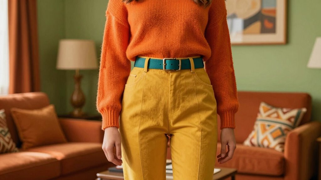
To keep your ’70s-inspired color palette balanced, focus on pairing bold hues with neutral accents. This prevents your space from feeling overwhelming and helps the colors stand out more effectively. By striking this balance, you can create a vibrant yet harmonious retro look. Incorporating investment diversification strategies can also help maintain a stable and appealing aesthetic in your overall decor approach.
Balance Bold Colors
Balancing bold ’70s colors can be tricky, but with a few simple tips, you can create a vibrant yet cohesive look. Start by understanding color psychology—know which shades evoke energy, warmth, or calmness—and choose hues that suit your mood. Next, limit your palette to 2-3 dominant colors to prevent overload. Incorporate vintage accessories in neutral tones to ground your outfit and add authenticity. Additionally, consider pairing bold colors with softer shades or textures to create contrast without overwhelming. Finally, don’t forget to balance your look with subtle patterns and simple silhouettes. By following these tips, you’ll master mixing ’70s colors, making your style both lively and harmonious.
Use Neutral Accents
Neutral accents are key to preventing your ’70s-inspired look from feeling overwhelming. They create a calm balance amid bold, vibrant colors, allowing your outfit to feel cohesive rather than chaotic. Incorporate neutral accents like beige, taupe, or soft white in accessories, shoes, or small clothing details. These subtle touches add visual interest without competing with more vivid hues. Using neutral accents also helps achieve subtle color contrasts that make your outfit pop without overdoing it. For example, pair a bright orange top with beige pants or add a taupe belt to a colorful dress. This approach keeps your look grounded, sophisticated, and true to ’70s style while maintaining a modern, polished vibe. Keep it simple, and let the colors speak for themselves. neutral accents are also useful for balancing bold patterns and textures, ensuring your ensemble remains stylish yet harmonious. Incorporating color harmony principles can further enhance your outfit by creating visually appealing combinations that feel effortless and well-coordinated. Additionally, understanding vetted color palettes helps you select hues that naturally complement each other to achieve a cohesive retro look. Embracing a mindful approach to color coordination ensures your outfit remains balanced and true to the nostalgic aesthetic. Using color theory as a guide can help you make confident choices when mixing and matching colors for a polished, vintage-inspired ensemble.
Popular ’70s Color Combinations That Feel Fresh Today
Many ’70s color combos are making a vibrant comeback, proving that retro hues can feel surprisingly fresh today. You’ll notice bold pairings that breathe new life into vintage floral and psychedelic patterns. For example:
- Bright orange with teal creates a lively, energetic vibe.
- Mustard yellow paired with deep burgundy adds warmth and richness.
- Psychedelic patterns feature swirling purples and lime greens, making a striking statement.
- Soft pinks combined with avocado green give a modern twist to classic vintage floral designs.
- Incorporating color mixing techniques can help you achieve seamless and eye-catching combinations that enhance the retro aesthetic.
These combinations maintain that nostalgic feel while feeling fresh and current. Whether you’re updating home decor or fashion, mixing these colors ensures your style stays vibrant and on-trend, capturing the essence of ’70s flair with a modern edge.
Find the Perfect ’70s-Inspired Colors for Your Skin Tone and Space

Choosing colors that complement your skin tone makes you look radiant and confident, so pick shades that enhance your natural glow. For your space, opt for ’70s-inspired hues that boost the room’s vibe and reflect your personality. When you match colors thoughtfully, both your style and environment come alive with authentic retro flair.
Complement Your Skin Tone
Finding the right ’70s-inspired colors for your space begins with understanding your skin tone. When you focus on skin tone matching, you can select colors that enhance your natural complexion and create color palette harmony. To get started:
- Identify if your skin has warm, cool, or neutral undertones.
- Warm undertones pair well with earthy oranges, warm browns, and golden yellows.
- Cool undertones look great with teals, icy blues, and lavender shades.
- Neutral skin tones can experiment with both warm and cool hues for balance and versatility.
Enhance Your Space Aesthetics
To enhance your space’s aesthetics with ’70s-inspired colors, start by selecting shades that complement both your skin tone and the overall vibe you want to create. Think about vintage patterns and how they can add authentic retro charm to your decor. Use color psychology to choose hues that evoke warmth, energy, or calm, depending on your mood. Deep oranges, mustard yellows, and avocado greens work well for lively, nostalgic atmospheres, while softer browns and muted teals create a more relaxed feel. Incorporate these colors into accent walls, furniture, or accessories to achieve a cohesive ’70s look. Balancing vintage patterns with strategic color choices guarantees your space feels both stylish and inviting, perfectly capturing the essence of retro nostalgia.
Where to Shop for ’70s Color-Inspired Fashion and Decor

If you’re enthusiastic to embrace the vibrant hues of the ’70s, several stores and online shops make it easy to find fashion and decor inspired by that colorful era. For a true retro vibe, explore vintage vinyl shops for album covers in bold, eye-catching colors. Look for shops specializing in disco fashion, featuring flared pants, sequined tops, and platform shoes that scream ’70s glam. Thrift stores and online marketplaces like Etsy offer authentic vintage pieces and decor that reflect the era’s bold palette. Big box retailers also carry modern reproductions of ’70s-inspired furniture and accessories. To dive deeper, check out these options:
- Vintage vinyl marketplaces
- Disco fashion boutiques
- Thrift stores & Etsy shops
- Modern retailers with retro collections
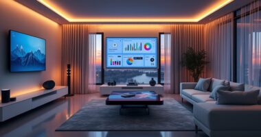
Modern Ways to Update ’70s Colors for Today’s Style
Revamping ’70s colors for today’s style involves balancing bold hues with modern aesthetics. You can do this by pairing vintage accessories with updated color schemes or using retro typography in your decor. Incorporate bright oranges, avocado greens, or mustard yellows into minimalist designs for a fresh look. Mixing these colors with sleek furniture or clean lines keeps the vibe current. To help visualize, here’s a simple guide:
| Color Palette | Style Tip | Accessories |
|---|---|---|
| Mustard Yellow | Use in accent walls | Retro typography posters |
| Avocado Green | Add via cushions or decor | Vintage accessories like lamps |
| Bright Orange | Incorporate in statement pieces | Bold art prints |
This approach keeps ’70s colors relevant and stylish today.
Frequently Asked Questions
How Can I Create a Cohesive Retro ’70s Look?
To create a cohesive retro ’70s look, start with vintage patterns like bold florals or geometric designs. Incorporate color blocking by pairing contrasting yet complementary shades, such as oranges with browns or teals with yellows. Mix and match these elements thoughtfully across your clothing and accessories, and don’t forget to add classic ’70s touches like bell-bottoms or platform shoes to complete your authentic vibe.
Are There Specific Fabrics Best for ’70s-Inspired Outfits?
Think of fabrics for vintage, retro textile choices as the heartbeat of the ’70s. You’ll want to choose materials like suede, velvet, and polyester, which capture that authentic feel. These fabrics bring both texture and nostalgia, making your outfit stand out. Opt for bold patterns and rich textures to truly embody the era’s vibe. With these choices, you’ll create a look that’s both stylish and true to the retro spirit.
What Accessories Complement ’70s Color Palettes?
You should choose accessories like boho headbands and bold statement jewelry to complement ’70s color palettes. These pieces add a fun, vintage vibe and enhance your outfit’s retro feel. Opt for wide-brim hats or layered necklaces to really make a statement. Bright, earthy tones in your accessories will tie your look together, making it authentic and eye-catching. Don’t forget to match your accessories to the vibrant, warm hues of the ’70s palette.
How Do I Adapt ’70s Colors for a Professional Setting?
You can adapt ’70s colors for a professional setting by balancing bold patterns and vintage furniture with neutral tones. Start with a classic blazer or blouse in earthy oranges or deep browns, then add subtle accessories like a vintage-inspired watch or muted jewelry. This juxtaposition keeps your look polished while giving a nod to retro vibrancy, ensuring you stay stylish and appropriate in any professional environment.
Can Modern Technology Influence ’70s Color Trends?
Modern technology, like digital color matching and smart fashion apps, definitely influences ’70s color trends. You can use these tools to find authentic shades or create new variations that suit your style. They make it easy to experiment with ’70s-inspired palettes and guarantee your choices are precise. So, whether you’re designing or dressing, tech helps you stay true to the retro vibe while adding a modern twist.
Conclusion
Ready to embrace the bold charm of the ’70s? These vibrant, earthy tones are more than just a blast from the past—they’re waiting to transform your style and space. Whether you’re adding a pop of color or creating a cozy retro vibe, the possibilities are endless. But beware—once you start incorporating these hues, you might find yourself completely captivated, unable to resist the allure of the ’70s. Are you prepared to make that leap?