
Mixing patterns in your decor is easier when you start with a dominant pattern that sets the tone. Balance large and small scales, and create harmony by repeating colors and motifs across rugs, pillows, and curtains. Incorporate neutral shades for cohesion, and pay attention to contrast levels to keep everything visually interesting. With these simple tips, you’ll achieve stylish, balanced spaces—if you keep exploring, you’ll discover even more ways to perfect your pattern mix.
Key Takeaways
- Choose a unifying color palette to ensure harmony across rugs, pillows, and curtains.
- Mix large and small patterns to create visual interest without overwhelming the space.
- Support dominant patterns with smaller, simpler prints for balance and cohesion.
- Repeat key motifs or colors from one element to another to tie the decor together.
- Pay attention to pattern scale and contrast to maintain a balanced, harmonious look.
Get Started: How to Mix Patterns in Your Home

Starting to mix patterns in your home can feel overwhelming, but with a few simple guidelines, you’ll find it easier than you think. Focus on texture pairing by combining different fabrics and materials—think plush pillows with sleek curtains or a woven rug with smooth upholstery. This approach not only adds visual interest but also creates a cozy, inviting atmosphere. Next, consider color coordination: pick a cohesive color palette to tie your patterns together. Use shades from your existing decor or choose a dominant hue, then introduce complementary or analogous colors for variety. Keep the scale of patterns in mind; mix large and small designs to create balance. Being mindful of visual harmony ensures your space feels lively yet harmonious. Incorporating natural elements and sustainable design principles can also enhance the overall aesthetic and environmental consciousness of your space. Additionally, understanding pattern proportion can help you achieve a balanced and cohesive look. When selecting fabrics and finishes, paying attention to surface textures can further enrich your interior design. Starting with these basics makes pattern mixing approachable, helping you craft a lively, harmonious look that reflects your style.
Why Mixing Patterns Will Transform Your Decor
Mixing patterns adds visual interest to your space, making it feel more engaging and lively. It also helps create dynamic rooms that keep your eye moving and prevent monotony. When you master pattern mixing, your decor transforms into a stylish, personalized environment. Incorporating balanced design principles ensures your patterns complement each other, creating a cohesive and aesthetically pleasing look. Additionally, understanding the importance of visual harmony can guide you in selecting patterns that work well together, emphasizing the beauty of simplicity in your decor. Recognizing design balance can further enhance your ability to combine patterns effectively, resulting in a more polished and harmonious overall appearance.
Adds Visual Interest
Have you ever noticed how a carefully curated mix of patterns can instantly make a room feel more dynamic and lively? Mixing patterns creates visual interest by engaging your eye with varied textures and shapes. It adds depth and personality, transforming a plain space into something vibrant. To achieve this, focus on balancing texture contrast and color harmony. For example, combine a floral pillow with a geometric rug and a striped curtain, as shown below:
| Pattern Type | Texture Contrast | Color Harmony |
|---|---|---|
| Floral | Soft velvet | Complementary tones |
| Geometric | Smooth linen | Coordinated shades |
| Stripes | Textured cotton | Balanced palette |
This interplay keeps your decor fresh and engaging, preventing monotony.
Creates Dynamic Spaces
Wondering how to make your space feel more lively and engaging? Mixing patterns creates dynamic spaces by adding depth and movement. To do this effectively, focus on:
- Using pattern repetition to tie different elements together visually.
- Coordinating colors to make sure patterns complement rather than clash.
- Varying pattern scales to introduce contrast and interest.
- Balancing bold and subtle prints for harmony.
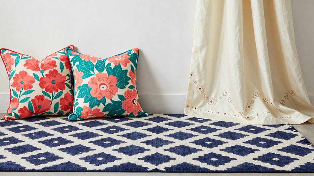
Choose a Dominant Pattern to Anchor Your Space
Start by selecting a focal pattern that grabs attention and sets the tone for your space. Use bold or subtle tones to guarantee it complements your overall style without overwhelming the room. Keep the scale and style balanced so the pattern anchors your decor seamlessly. Incorporating wall art trends such as digital frames or interactive murals can also enhance the focal point and create a cohesive look. Additionally, choosing patterns with varying caffeine levels can influence the energy and mood of the room, subtly affecting how your space feels. Exploring visual harmony principles can help in selecting patterns that promote balance and aesthetic appeal. Considering pattern scale is essential to ensure the design maintains harmony and doesn’t disrupt the room’s flow. Understanding how metabolic health impacts overall well-being can also inspire your space’s design choices to foster a healthier environment.
Select a Focal Pattern
Choosing a focal pattern is essential to anchoring your space and creating visual harmony. Your focal pattern acts as the statement design that draws the eye and sets the tone. To select yours, consider these ideas:
- Pick a bold rug with a striking pattern as the room’s centerpiece. For inspiration, exploring popular interior design trends can reveal which patterns are currently in style.
- Use curtains with an eye-catching print to frame the space.
- Incorporate pillows with a dominant design that stands out on neutral furniture.
- Match the patterns in your rugs, pillows, or curtains for a cohesive statement.
- Incorporate vintage-inspired patterns that evoke nostalgia and add character to your decor vintage audio/vinyl revival.
Use Bold or Subtle Tones
Selecting a dominant pattern with bold or subtle tones helps anchor your space and sets the overall mood. When choosing this pattern, consider your color coordination to guarantee harmony across your décor. Bold tones create a striking focal point, giving your room energy and vibrancy, while subtle tones foster a calm, sophisticated atmosphere. Establishing a clear pattern hierarchy helps prevent visual chaos; the dominant pattern should stand out without overwhelming. Use color contrast wisely to differentiate the main pattern from supporting elements like pillows or curtains. This approach guides the eye naturally through your space, creating a cohesive look. By thoughtfully selecting a dominant pattern with either bold or subtle tones, you set a strong foundation for mixing patterns seamlessly.
Balance Scale and Style
To effectively balance scale and style, you need to pick a dominant pattern that anchors your space and reflects your overall aesthetic. This pattern sets the tone and creates visual stability. When choosing, consider pattern contrast—pairing bold with subtle patterns for balance—and prioritize color harmony to unify different elements. Here are some tips:
- Select a large-scale pattern as your focal point.
- Ensure the dominant pattern’s colors complement other textiles.
- Use smaller or simpler patterns to support the main pattern without overwhelming.
- Maintain a consistent style to prevent chaos and create cohesion.
Master Pattern Scale for a Cohesive Look

Ever wonder how to make different patterns work seamlessly together in your space? The key is mastering pattern scale. Start by establishing scale harmony, ensuring that larger patterns don’t overpower smaller ones. Think of pattern hierarchy as a visual roadmap: big, bold designs set the tone, while smaller patterns add detail without competing. Use a dominant pattern as your anchor, then layer in medium and small-scale patterns to create depth. Consistent pattern scales help your space feel cohesive and balanced, preventing chaos or visual confusion. Keep in mind that mixing patterns isn’t just about variety—it’s about deliberate contrast in size and impact. When you control pattern scale thoughtfully, your room will look intentional, harmonious, and effortlessly stylish. Incorporating visual balance into your pattern choices further enhances the overall cohesion and appeal. Additionally, paying attention to pattern repetition can create a more unified and polished look that ties the room together. Achieving pattern harmony is essential for a cohesive design that feels natural and refined. Understanding pattern scale as a fundamental concept can simplify your design process and elevate your decor.
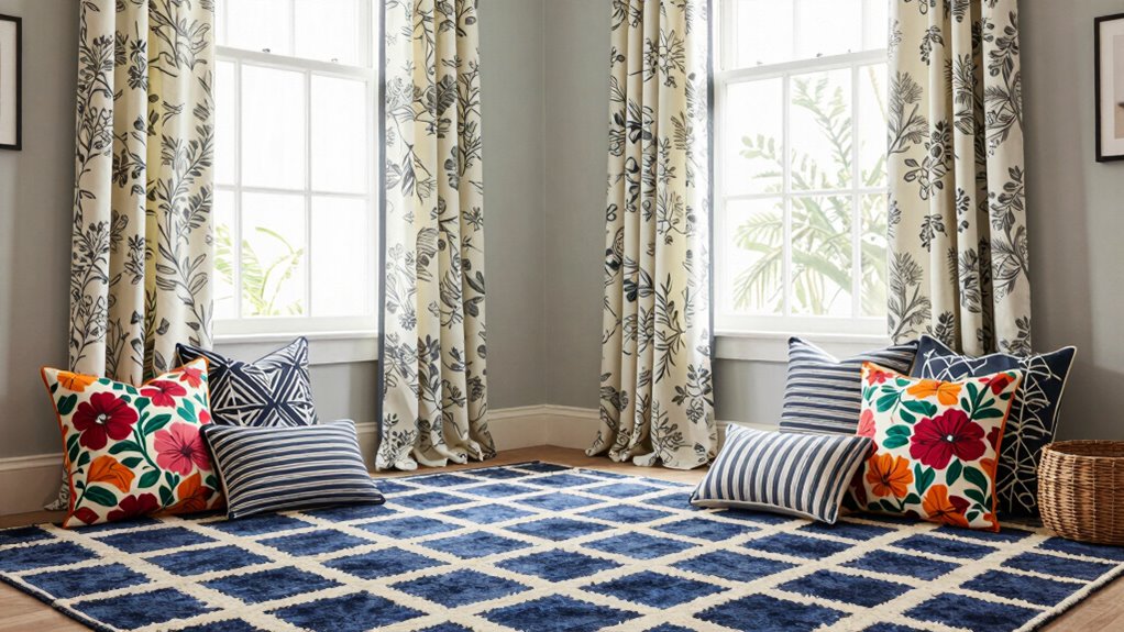
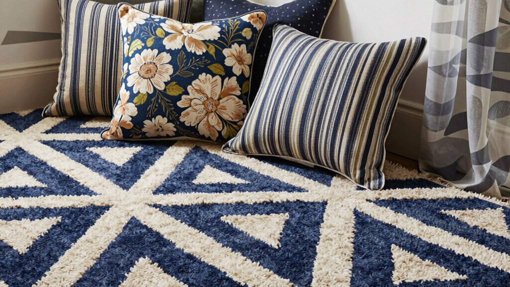
Pair Rugs, Pillows, and Curtains Like a Pro
Once you’ve established a balanced pattern scale, the next step is to coordinate rugs, pillows, and curtains for a unified look. Focus on pattern matching and color coordination to create harmony. Here are four tips:
Coordinate rugs, pillows, and curtains with color harmony and matching patterns for a cohesive, stylish space.
- Use complementary colors across all three elements to ensure visual cohesion.
- Mix patterns with similar scales to avoid overwhelming the space.
- Incorporate a neutral shade in each piece to anchor diverse patterns.
- Repeat a key color or motif from the rug in your pillows and curtains for subtle consistency.
- Pay attention to the cabling solutions involved in hanging curtains or installing accents to ensure a clean, professional finish. Additionally, understanding fabric durability can help you select textiles that maintain their appearance over time, especially when considering wear and tear in high-traffic areas. Selecting fabrics with high abrasion resistance can further extend the lifespan of your decor elements. Moreover, choosing proper fabric care techniques can preserve their vibrant patterns and textures for years to come.
Common Pattern Mixing Mistakes and How to Avoid Them
Mixing patterns can instantly elevate your space, but it’s easy to make mistakes that disrupt harmony. One common mistake is clashing patterns, which happen when you choose prints that compete instead of complement each other. To avoid this, steer clear of mixing too many bold or contrasting patterns without a unifying element. Overmatching patterns is another trap—trying to perfectly match all patterns can make your space feel monotonous and lifeless. Instead, aim for a balanced mix of similar tones or styles, adding variety without overdoing it. Also, pay attention to scale; mixing large and small patterns without considering their proportions can create visual chaos. Remember, the goal is harmony, not uniformity. Keep it simple, intentional, and trust your eye.
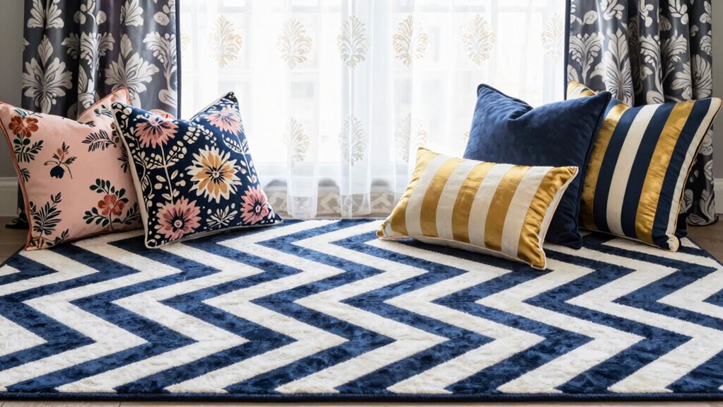
Real-Life Examples of Stylish Pattern Combinations

You can see how stylish pattern combinations bring a space to life when you look at real-world examples. Floral combinations add softness and romance, while geometric contrasts introduce structure and modernity. Here are some ideas:
- A floral pillow paired with a chevron rug creates a cozy yet dynamic look.
- Curtains with bold geometric patterns balanced by delicate floral accents add visual interest.
- Mix a floral duvet cover with geometric throw pillows for a lively bedroom vibe.
- Combining floral wallpaper with geometric curtains emphasizes both softness and boldness.
- Incorporating pattern harmony principles helps ensure that contrasting patterns complement rather than clash, creating a cohesive and visually appealing space. Additionally, understanding pattern proportions can help balance different designs effectively.
These combinations show how contrasting patterns can work together harmoniously, making your space feel vibrant and balanced without overwhelming. Recognizing visual cues can further enhance your ability to create cohesive and appealing pattern mixes.
Fine-Tune Your Pattern Mixes for Perfect Harmony
To achieve a balanced and visually appealing pattern combination, focus on fine-tuning the details to create harmony. Start by paying attention to pattern repetition; repeating certain motifs or shapes across your rugs, pillows, and curtains links the different elements and creates cohesion. Additionally, consider the contrast ratios of your patterns, as varying contrast levels can add depth and interest to your decor. Next, prioritize color coordination by selecting a common color palette or complementary hues to unify the patterns. This prevents the mix from feeling chaotic and helps each piece stand out without overwhelming the space. Adjust the scale of your patterns if needed, pairing larger motifs with smaller ones for balance. Small tweaks like these ensure your pattern mixes feel intentional and harmonious, giving your room a polished, stylish look. Incorporating water-themed elements can also add an extra layer of cohesion, especially in spaces with aquatic or tranquil decor themes.
Frequently Asked Questions
How Do I Choose Patterns That Suit My Personal Style?
To choose patterns that suit your personal style, start by exploring pattern psychology to understand how different designs evoke emotions. Consider your preferred style—whether modern, bohemian, or classic—and aim for pattern harmony that complements it. Mix patterns thoughtfully by balancing bold and subtle designs, ensuring they reflect your personality. Trust your instincts and choose patterns that make you feel comfortable and inspired, creating a space that truly feels like you.
Can Pattern Mixing Work in Small Spaces?
Sure, mixing patterns in small spaces can be a masterpiece—if you love chaos. Just remember, scale considerations matter; opt for smaller patterns that won’t overwhelm, and add texture contrasts to create depth without clutter. You want your space lively, not claustrophobic. So, if you embrace balance and variety, your tiny room can become a stylish playground of patterns, proving less really is more—just with a twist.
What Are Some Budget-Friendly Pattern Combination Ideas?
You can create budget-friendly pattern combinations by mixing patterns with varied scales and textures. For example, pair a large-scale striped rug with smaller, textured pillows to add visual interest without overspending. Focus on contrasting textures like smooth and rough, and balance bold patterns with subtle ones. Using affordable options like DIY accents or thrifted pieces can help you achieve a layered, stylish look without breaking the bank.
How Do I Update My Pattern Mixes Seasonally?
To update your pattern mixes seasonally, start by embracing a pattern clash with seasonal motifs, like florals for spring or warm plaids for fall. Mix textures to add depth—think velvet pillows or woven curtains. Swap out lighter fabrics for heavier ones, and incorporate seasonal colors to keep your space fresh. This approach keeps your decor vibrant and cozy, perfectly suited for each season’s vibe.
Are There Specific Color Palettes That Make Pattern Mixing Easier?
Yes, choosing complementary color schemes makes pattern mixing easier because they create vibrant contrasts that balance well. You can also opt for analogous palette choices, which feature neighboring colors on the color wheel, ensuring harmony. By combining these palettes, you simplify pattern mixing, making it more visually appealing without overwhelming your space. Stick to these strategies, and you’ll effortlessly create cohesive, stylish combinations that feel intentional and fresh.
Conclusion
Mixing patterns can instantly elevate your home’s style, and you’re more capable than you think. Did you know that homes with thoughtfully combined patterns tend to feel 30% more inviting? By choosing a dominant pattern, balancing scale, and mixing textures, you’ll create a cohesive, lively space. Keep experimenting, avoid common mistakes, and trust your eye. With these tips, your decor will be both stylish and uniquely yours—ready to impress every guest who walks through your door.