Butter yellow and pastel tones are increasingly shaping design and fashion, creating a soothing, optimistic palette. These colors blend soft, muted shades like blush pinks, mint greens, and lavender with warm buttery hues such as creamy yellows and caramel. They evoke feelings of calm, comfort, and hope, making spaces and styles feel modern yet familiar. Staying ahead means embracing these gentle, versatile shades—something you’ll discover more about as you explore these emerging color drenched trends.
Key Takeaways
- Butter yellow and pastel hues are trending together, creating warm, soothing color palettes in fashion, interior design, and branding.
- These colors evoke feelings of calm, optimism, and comfort, making spaces and styles more inviting and serene.
- The trend emphasizes blending pastel shades with buttery tones for fresh, modern, and versatile aesthetics.
- Use of these colors is expanding in digital spaces, fashion runways, and home decor, shaping perceptions of tranquility and positivity.
- Combining butter yellow with pastels promotes harmony, offering a balanced, nostalgic yet contemporary visual experience.
Have you ever wondered how color trends shape the way we see and experience the world around us? They influence everything from fashion choices to interior decor, guiding us toward shades that evoke specific emotions or moods. Right now, one of the most enchanting trends revolves around pastel palettes and buttery hues, creating a sense of calm, optimism, and subtle sophistication. These soft, muted colors have gained popularity because they seamlessly blend comfort with style, offering a fresh yet familiar aesthetic that appeals to many.
Pastel and buttery hues evoke calm, optimism, and timeless elegance in fashion and design.
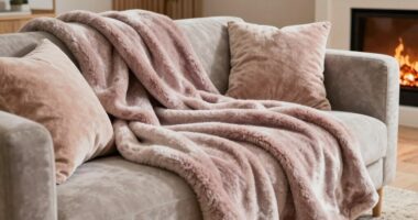
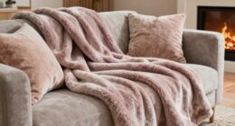
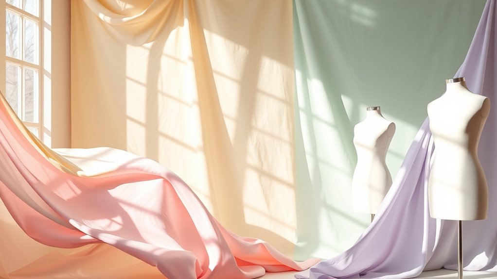
When you think of pastel palettes, picture gentle shades like blush pinks, mint greens, lavender purples, and sky blues. These colors are light, airy, and versatile, making them perfect for a variety of applications. They’re not overpowering but instead serve as a soothing backdrop that enhances rather than dominates. This trend encourages you to embrace more delicate hues in your wardrobe, home, and even your digital spaces. Whether you’re decorating a bedroom or updating your website, pastel palettes can help create an inviting atmosphere that feels both modern and timeless.
But what truly makes these colors stand out are the buttery hues—those warm, soft tones reminiscent of melted butter or golden sunlight. These buttery shades, like creamy yellows, soft caramel, and warm beige, add a touch of richness and warmth to the pastel spectrum. They’re not just pretty; they evoke feelings of comfort and stability, making them ideal for spaces or styles that aim to foster relaxation and positivity. Using buttery hues in your decor or fashion can instantly uplift your mood and add a cozy layer that balances the coolness of more pastel shades.
This emerging trend isn’t just about aesthetics; it’s about creating an experience. When you incorporate pastel palettes and buttery hues into your environment, you’re embracing a visual language that communicates serenity and hope. It’s a response to the fast-paced, often overwhelming world we live in, offering a gentle retreat into tranquility. Designers and brands are leaning into these shades for their ability to evoke nostalgia while feeling fresh and relevant.
In practice, you might combine a soft lavender wall with buttery yellow accents or wear a pastel pink dress paired with warm caramel accessories. These combinations not only look appealing but also promote a sense of harmony and balance. As this trend continues to grow, expect to see pastel palettes and buttery hues everywhere—from fashion runways and home interiors to branding and digital design—helping shape the way we see and experience our surroundings with a gentle, optimistic glow.
Frequently Asked Questions
How Can I Incorporate Butter Yellow Into My Home Decor?
You can incorporate butter yellow into your home decor by choosing it for wall paint ideas, creating a warm and inviting atmosphere. Coordinate this color with soft pastels or neutral tones to balance the brightness. Use butter yellow in accent pieces like cushions, vases, or artwork to add cheerful pops of color. This approach helps you develop a cohesive color palette that feels fresh and harmonious throughout your space.
Are Pastel Colors Suitable for Professional Office Environments?
Pastel colors can be suitable for professional office environments when used thoughtfully. Incorporate these hues into your office color schemes through subtle accents like pillows, artwork, or stationery. For your professional wardrobe tips, choose pastel blouses or accessories that add a soft touch without overwhelming. Keep the overall look balanced and polished, ensuring the space and attire remain appropriate and sophisticated while embracing these gentle, trendy tones.
What Skin Tones Complement Butter Yellow and Pastel Shades?
You’ll find that butter yellow and pastel shades complement warm skin tones beautifully, highlighting your natural glow. If you have cool undertones, opt for makeup tips for pastel to enhance your look, like soft pink or lavender eyeshadows. For neutral skin tones, these colors work effortlessly, so don’t hesitate to experiment. Remember, confidence is key, so choose shades that make you feel your best and reflect your personal style.
How Durable Are Pastel and Butter Yellow Fabrics in Daily Use?
You’ll find that pastel and butter yellow fabrics are quite durable for daily use, but proper fabric care is essential to maintain their vibrancy. Regular washing in cold water and avoiding excessive exposure to sunlight help prevent color fading. Additionally, using gentle detergents and avoiding harsh chemicals will keep these shades looking fresh longer. With proper care, your pastel and butter yellow pieces stay bright and beautiful through everyday wear.
Can These Trending Colors Be Mixed With Bold, Dark Hues?
Yes, you can mix butter yellow and pastels with bold, dark hues to create striking color pairing. These soft shades add a fresh, airy feel, while dark hues bring depth and contrast. This combination enhances your design versatility, making your outfits or decor more dynamic. Just balance the tones carefully, and you’ll achieve a stylish, modern look that highlights both the subtlety of pastels and the boldness of darker shades.
Conclusion
As you embrace these buttery yellows and pastel hues, imagine your wardrobe blossoming like a sunrise painted across the sky. These colors wash over your style, turning everyday moments into a canvas of soft, vibrant strokes. Let the emerging trends be your palette, blending warmth and serenity in perfect harmony. With each choice, you’re crafting a visual symphony—an artful dance of color that captures attention and invites admiration.